Font faces
DCC’s primary font face is:
Open Sans Regular
This font can be used for headers.
The following secondary font group can be used in other areas of the site:
"Helvetica Neue",Helvetica,Roboto,Arial,sans-serif
Font sizes
All DCC websites should have a minimum font-size:16px, letter-spacing:0.2px and line-height:24px for any copy.
It is recommended that the above values are applied to the body tag and em or rem values are used elsewhere.
Spacing for titles and sub-titles
Titles and sub-titles should be given sufficient padding above and below to ensure they are easy to read. As a guide you should consider using at least 4 x the title height above and 1 x the height of the title below.
See example below.
This is a H1 title
This is some standard paragraph copy to illustrate spacing – Lorem ipsum dolor sit amet, consectetur adipiscing elit, sed do eiusmod tempor incididunt ut labore et dolore magna aliqua.
This is a h2 sub-title
This is some standard paragraph copy to illustrate spacing – Lorem ipsum dolor sit amet, consectetur adipiscing elit, sed do eiusmod tempor incididunt ut labore et dolore magna aliqua.
This is a h3 sub-title
This is some standard paragraph copy to illustrate spacing – Lorem ipsum dolor sit amet, consectetur adipiscing elit, sed do eiusmod tempor incididunt ut labore et dolore magna aliqua.
Lead paragraphs
Lead paragraphs should be sufficiently different in size, weight and spacing to the title and following content to clearly stand out.
There should only be one lead paragraph per page.
See example below.
This is a H1 title
This is some standard paragraph copy to illustrate spacing – Lorem ipsum dolor sit amet, consectetur adipiscing elit, sed do eiusmod tempor incididunt ut labore et dolore magna aliqua.
Links
Links should clearly stand out from the content that surrounds it. If a different colour is being used, then the following should be considered:
- Colour contrast is sufficiently different to make the links stand out.
- Links should display an underline on hover.
- If you are using an underline to highlight a link then this should be hidden on hover.
Lists
When presenting content in a list (bullet points) then the following approaches should be considered. Use simple bullets like dots or diamonds so that the readers’ focus stays on the text.
Approach 1: A list in which each point is a separate sentence.
We support the five Every Child Matters outcomes.
- Be healthy.
- Stay safe.
- Enjoy and achieve.
- Make a positive contribution.
- Achieve economic wellbeing.
Approach 2: A list which is one continuous sentence.
Payments can be made:
- at a post office
- at a bank
- by post
- at the Alliance & Leicester using the Girobank service.
Hidden text (progressive disclosure)
Use this approach to make your page easier to scan, only showing contextual information when required.
Accordions
Avoid accordions that auto hide other content areas to prevent the page jumping or scrolling unnecessarily. The user should be in control of what is displayed or hidden.
Full width copy
Avoid full page width copy on larger screens (landscape tablets and above), as shown in the example below. This makes the information on the page harder to read.
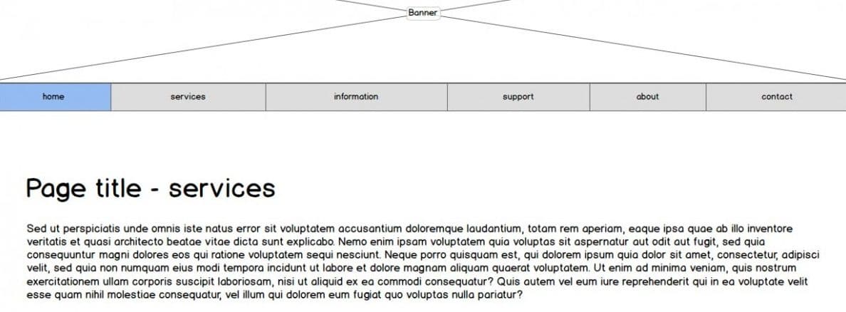
Note: If you do need to use a single column of copy on a larger screen, it is recommended that you reduce the width of the content’s container.
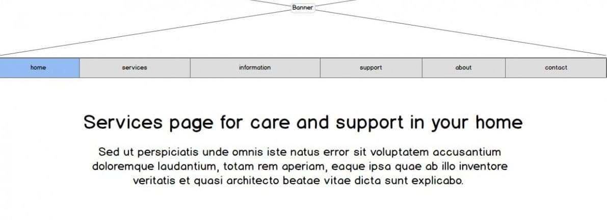
The full width of a page (or single column) can however be used for page titles or section headings as shown in the example below.
For further information about DCC’s copy writing style guide, download our Plain English Styleguide PDF